Protanos Sales App
Deliverables
Interaction Design: Hight-fidelity interactive prototypes for key tasks on mobile.
UI/UX Design:
– Site map
– Peronas
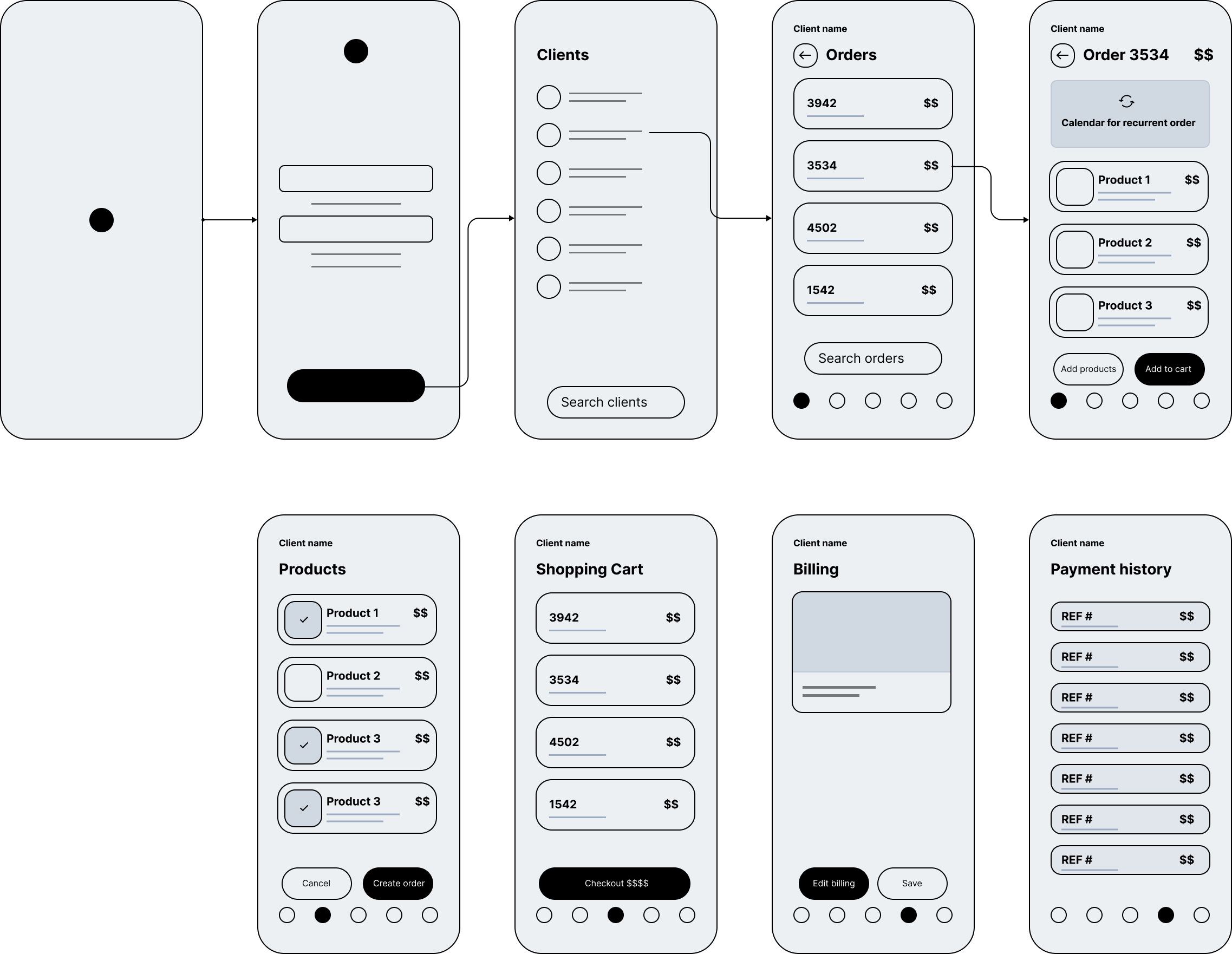
– Low-fidelity prototype
– High-fidelity prototyp
Roles
This is a concept project where I assumed the following roles:
– Interaction (IxD) Designer
– User Experience (UX) Designer
– User Interface (UI) Designer
Project specifications
Duration: 12 weeks
Tools:
– Sketch
– Figma
– Miro
– inVision
Overview
Protanos Bakery protanosbakery.com is one of southern FL’s largest wholesale distributors of bakery products. They sell hundreds of products like bread, cakes, cupcakes, etc., and they have over 50 years in the business.
How does Protanos work?
The following image represents Protano’s Fulfillment Process, from taking orders to product delivery to knowing how the company works. We will focus on the first stage of the process, the “Order capture,” where the sales agent collects the products, builds the order, and gets ready for production.
“We must remember that the products are fresh foods, requiring frequent deliveries, so the timing is crucial…”
Distribution manager

Portanos Fulfillment Process
Research
I used screener surveys to recruit interview participants to understand how users perceive the ordering process.
Here is the Whiteboard defining the Problem, Persona, Requirements, Brainstorming, and the sketch at a high level.
User surveys and interview highlights
– User surveys and interviews highlighted specific issues with the Salesforce UI in our application.
– 82% of users reported hindered readability and usability due to small font size.
– 74% of participants found the Salesforce UI non-intuitive, affecting user experience.
– Repeated need for the same ordering process, which 68% found cumbersome and inefficient.
– Sales agents emphasized the necessity of mobility, suggesting a mobile-friendly version could significantly enhance efficiency and user satisfaction.
These insights indicate a strong need for UI improvements, focusing on readability, process streamlining, and mobile usability.
Problem
Usability issues
- Users had difficulty finding the products in the search section to collect and create new orders.
- Users were using Salesforce organization without any customization, and it took a lot of clicks to reach customer contacts and duplicate orders.
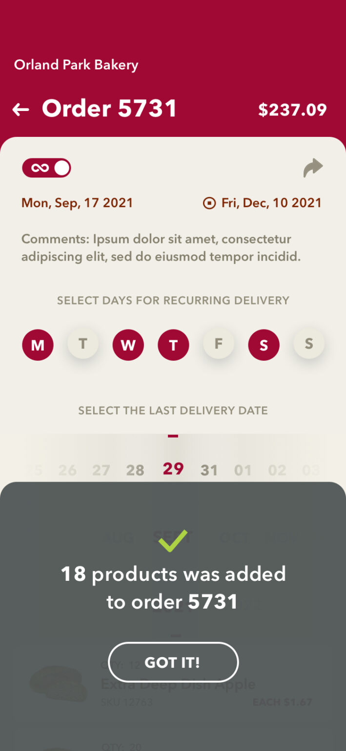
- Users needed to create a recurrent order. These orders would repeat every week until they stopped setting a finish date.
Ideas for improvements
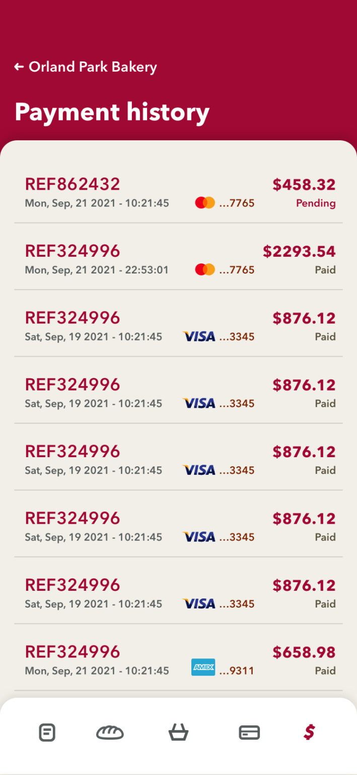
- The user would like to have a “payment history” section to follow up on the status of the payments.
- Users would like an action button “share” to send the receipts in PDF to their clients.
Requirements to keep in mind
- If the user wanted to duplicate an order, they had to create new orders from scratch, wasting time selecting and distributing the products.
- Another requirement is that the users can create recurring orders that will be repeated weekly.
- Another critical point is related to the date of the year. For example, the demand for bakery products increases exponentially during holidays, making the process chaotic.
Proposed Solution
To create a mobile app so the sellers could collect products from anywhere faster, avoiding repeat actions in the ordering process.
Sitemap
Once I achieved greater clarity on features and processes users require, I created a site map with three main areas that would encompass all user stories needed: start a new search, view their books, and access past reads.
First sketch
Identifying Design Patterns Through Rapid Sketching.
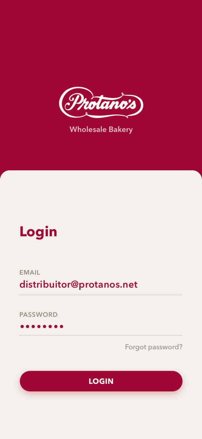
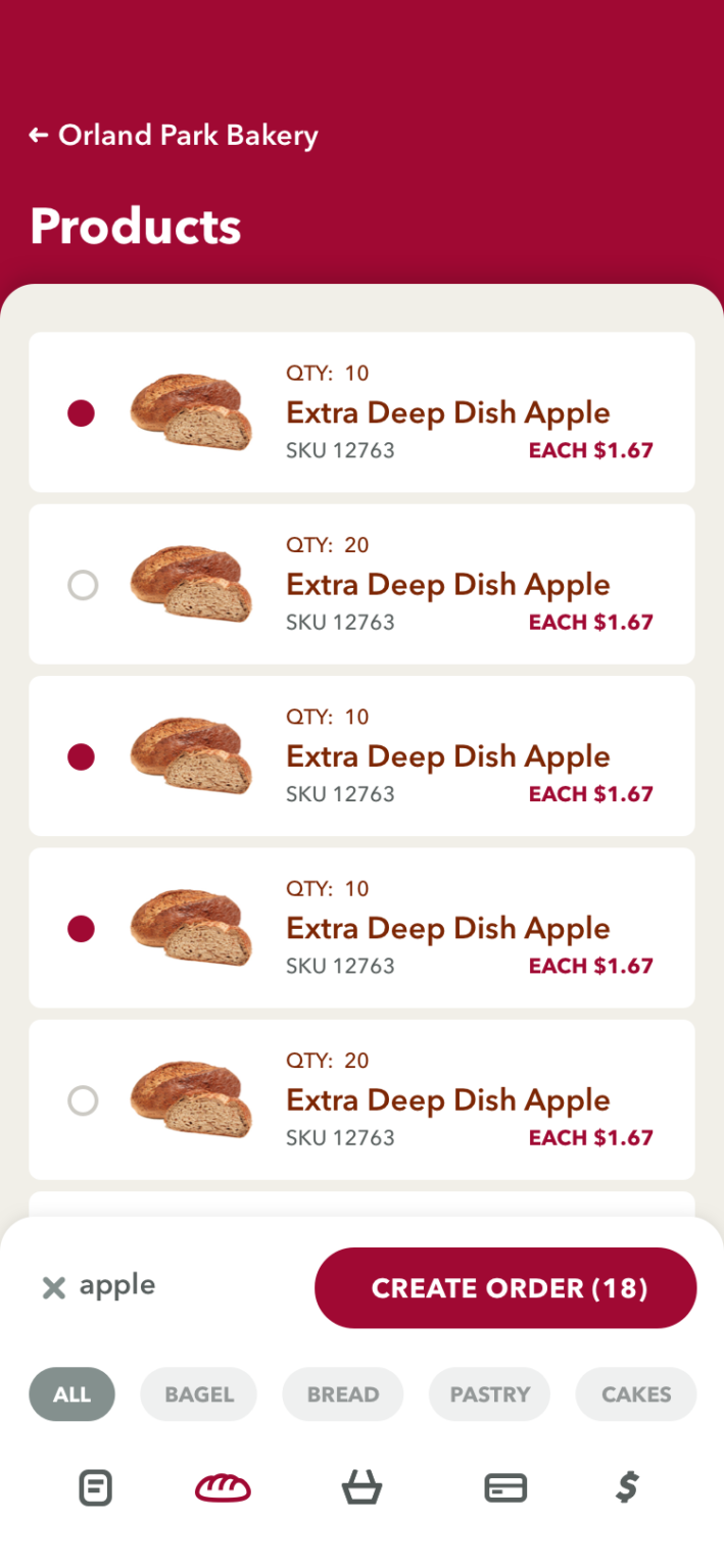
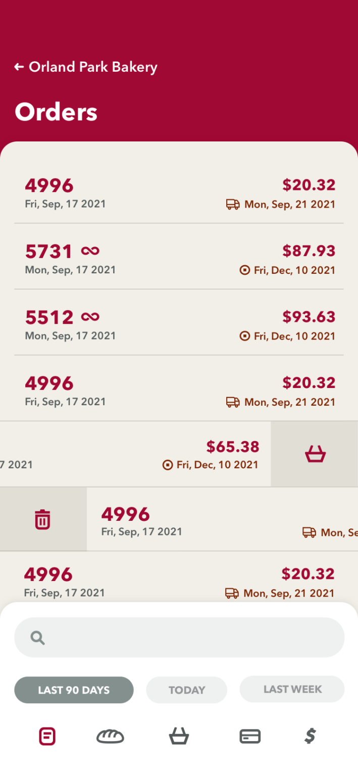
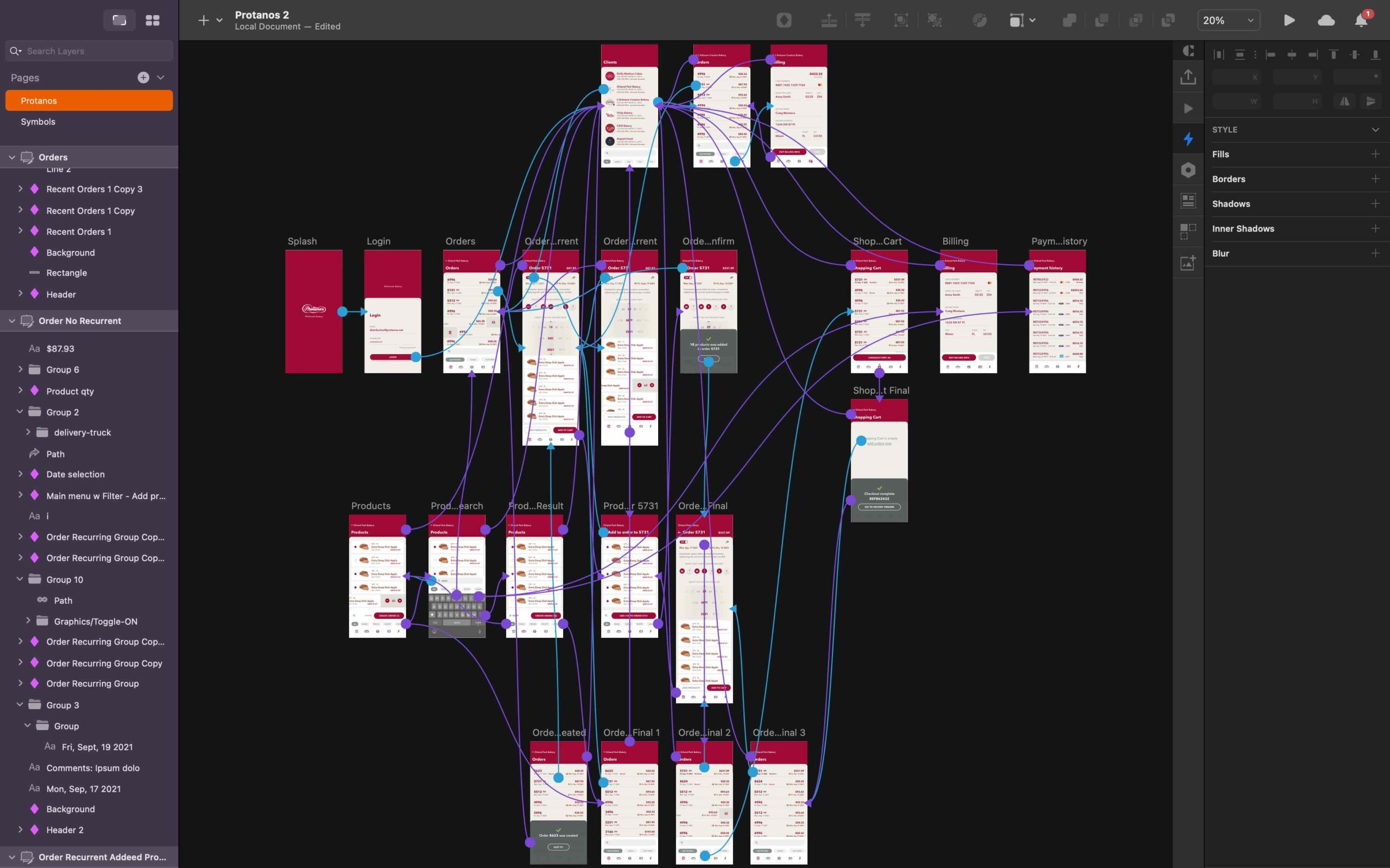
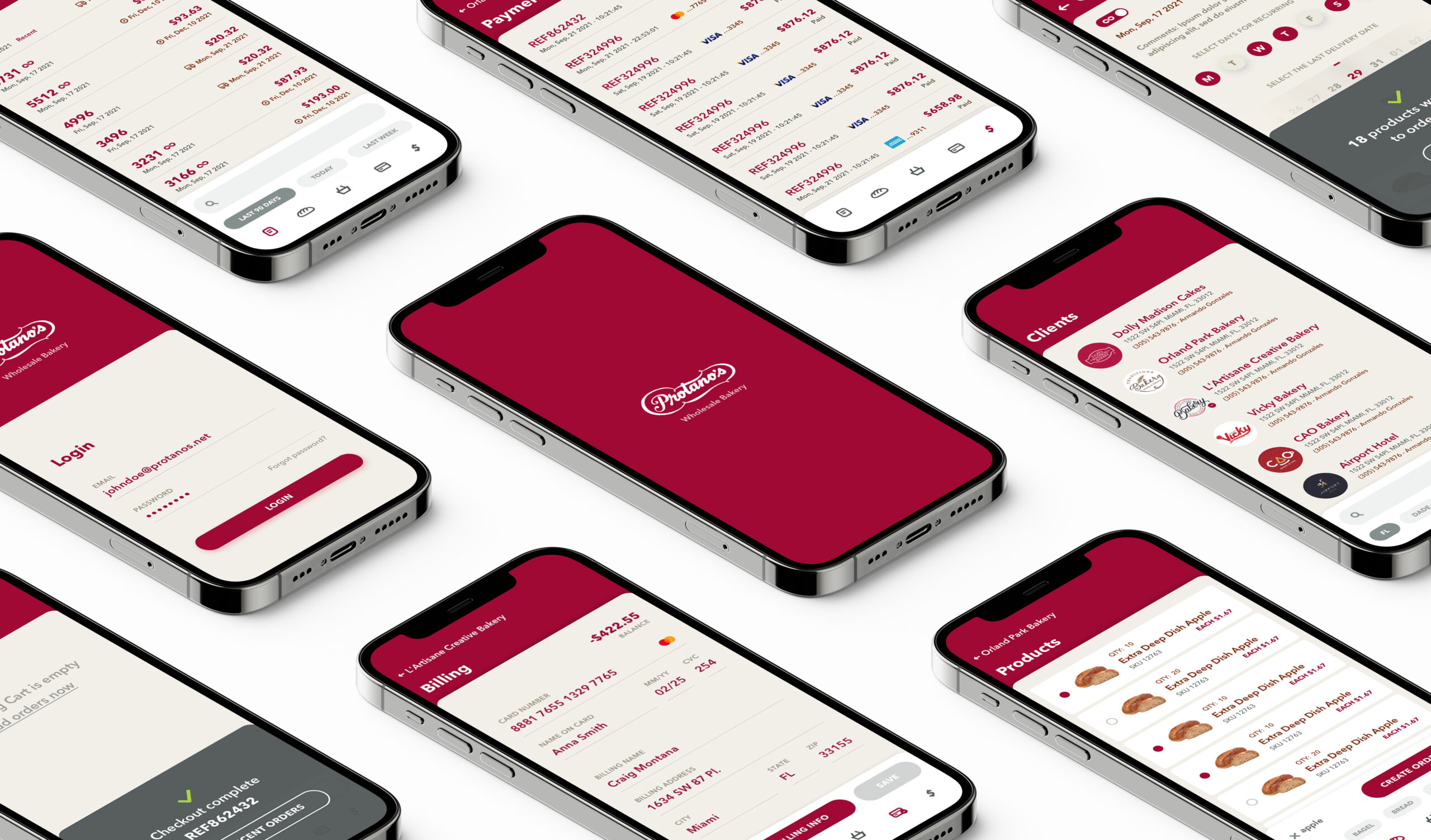
HI-FI Prototype in Sketch
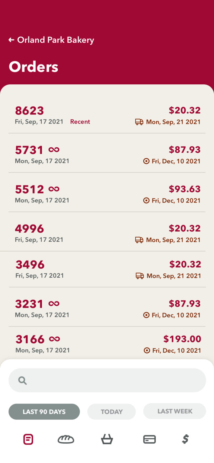
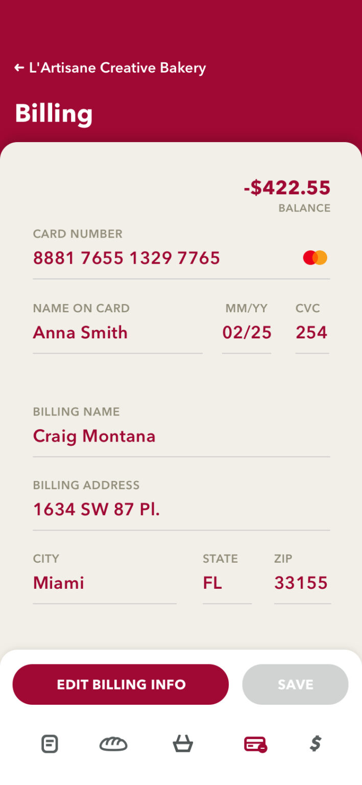
The final version of the HI-FI prototype is now available in Invision for stakeholders and users to provide feedback and comments. This version is the culmination of numerous inputs and suggestions from users and stakeholders throughout development.
Scan the QR with your mobile device to see the app.
